Every year, the design world shifts in unexpected and exciting ways. But 2026 feels different — a convergence of AI-assisted tools, spatial computing, and a collective desire for warmth and humanity in digital interfaces is driving some of the most meaningful changes the industry has seen in a decade.
In this article, we break down the key visual and interaction design trends our team at BI has been tracking — and more importantly, how to apply them purposefully rather than just following the crowd.
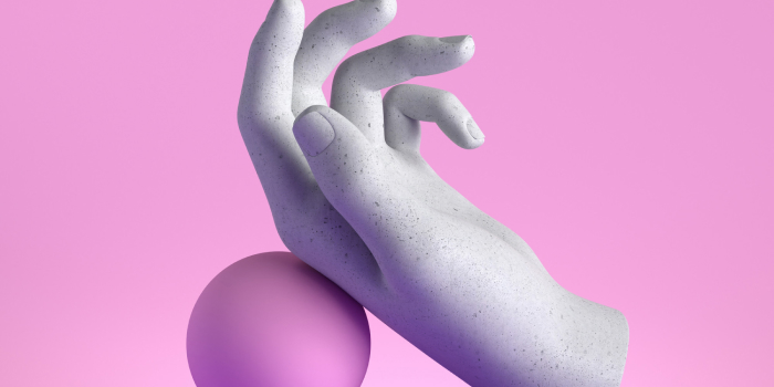
1. Spatial & Dimensional Design
With the rise of AR headsets and spatial displays, designers are thinking in three dimensions like never before. This doesn't mean every website needs a 3D hero — it means understanding depth, parallax, and layered compositions in a way that feels native to the medium.
The best implementations we've seen use subtle z-depth to create a sense of hierarchy without disorienting the user. Think floating cards that cast real shadows, scroll-triggered depth shifts, and interfaces that feel tangible.
"The future of design is not flat. It is dimensional, responsive, and deeply human."
2. Typographic Expression
Variable fonts have unlocked a new era of typographic boldness. We're seeing brands use type not just as a vehicle for words, but as a primary visual element — stretching, morphing, and animating letterforms in ways that were impossible just three years ago.
The key is restraint. One expressive typeface with tight control beats a chaotic mix of three decorative fonts every time.

3. AI-Augmented Interfaces
Artificial intelligence is no longer a feature — it's an expectation. Interfaces that learn from user behavior, adapt their content, and surface the right information at the right moment are setting the new standard for product design.
For designers, this means building systems that are flexible enough for the AI to slot into gracefully, rather than tacking AI onto a rigid design as an afterthought.
What This Means for Your Next Project
Before incorporating any trend, ask yourself: does this serve my user's goal, or does it serve my aesthetic preference? The best design is always invisible — it gets people where they need to go without calling attention to itself.
Start by auditing your current design system. Identify where adding depth, better typography, or adaptive content could genuinely improve the experience. Then, implement one change at a time and measure its impact.

Mark Daniel
Mark is the Creative Director at BI Creative Agency with 12 years of experience in brand identity, UX, and digital strategy. He writes about the intersection of design, technology, and business.